The hand that rocks the label
By Kelsey Klassen
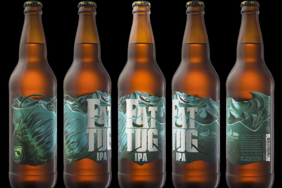
Richard Hatter had a difficult job and he knew it. His firm, Hired Guns, had been tapped to redesign the label for Fat Tug, one of B.C.’s most influential beers – and one that already had an iconic label.
According to Hatter, Driftwood was looking for a better representation of the beer visually: a big, bold illustration to replace the clean harbour scene of the 2010 original.
When Hatter was done, the Fat Tug tugboat was no longer enjoying the leisurely cruise of the old label. Hired Guns now has a stormy, turquoise, die-cut sea tossing the tugboat around, which warns of the beer’s darker side.
In the end, Hired Guns received both hazing and praise from Fat Tug loyalists, but the move won them CAMRA’s inaugural Best Beer Label Artwork Award in 2014, and the respect of the craft beer association’s 1,300 largely industry-based voters.
“Improvement is always an improvement,” says Hatter, confidently. “Sometimes it’s really easy and sometimes you get some backlash. Like, for the Fat Tug label,” he continues, “I was the asshole that changed everybody’s favourite beer.
“There were a few hilarious messages,” he adds with a laugh.
Hired Guns is a Nanaimo-based creative agency that saw the craft beer wave coming in B.C., and seven years ago decided to specialize in alcohol branding. Under the direction of Hatter and business partner Leif Miltenberger, Hired Guns has been responsible for the labels of more than 20 beers.
Going niche was a smart move, says the illustrator: with at least 53 breweries and 22 brew pubs now operating in B.C., the agency has recently had to add three more designers to keep up with demand.
“We chose alcohol because it’s a growing sector. [The industry] is really fun, it appreciates artwork, it needs artwork, it needs people that are passionate about the products to be creating that artwork,” says Hatter, “and it needs people who know what the hell they’re talking about to be creating that artwork.”
Hatter, a bearded Malaspina grad and conceptual devotee of the Swiss-Bauhaus school of design, uses a range of typography, colour and hand-drawn illustration to evoke the essence of the beer itself.
“One of the things we really try to focus on as a shop is making sure that no matter what the artwork style is, it’s speaking the language of what’s inside the bottle,” he explains. “Communicating flavour, and also attitude of the brewer and the product itself. Because it has to scream on the shelf, it has to get picked up, but there’s more to it than being loud.”
That focus on flavour is readily apparent when glancing through Hired Guns’ portfolio: the owl on Driftwood’s Obscuritas Dark Sour gazes irritably out of the darkness; the citrus notes of the White Bark Witbier practically spritz off the label’s orange peels; and Raised By Wolves races wildly across a tropical-coloured tundra.
While much has been said about matching label art to the tasting notes for some, it’s all about the name.
“A lot of times the name and the art go together more than the art and the beer,” says Ben Love, co-founder of Portland, Ore.’s Gigantic Brewing.
The craft brewery hires a new artist for each of its new seasonals, which means the look and feel of each Super Friends-style label varies dramatically as they venture around the world.
“With Gigantic we work with artists who typically don’t do commercial work,” explains Love, whose 29 labels so far include work by Mr. Lunch artist J. Otto Seibold, Emily the Strange creator Robert Reger, and illustrator Mar Hernández of Valencia, Spain. “It’s usually people who are doing gallery shows. And we don’t give them any direction,” he continues. “We just tell our artists the name of the beer, the beer style, and that’s it.”
With beer labels often acting as a customer’s first introduction to the brand, that lighthearted, shotgun approach can be risky.
“Some of the labels maybe won’t resonate with nearly as many people,” says Love, “but others are big winners. And at the end of the day, we might lose some people, but most of the people we want partying with us are there, drinking our beer, hanging out, and understanding what we’re doing.”
In fact, some of the most appealing beer labels right now seem to be those that celebrate the lighter side of life.
Parallel 49 Brewing, one of the fasting growing craft breweries in B.C., came out with kegs swinging in 2012 with its punny names and ska-style characters. The labels are the product of one artist, Steve Kitchen of Combination 13, who worked predominantly on band posters and album art in the past.
“It’s funny enough, finding him,” says Parallel 49 marketing manager Chris Bjerrisgaard. “When the guys started the brewery, Steve was the first guy to apply. But his artwork’s so good, that the guys were like, ‘Well, we really didn’t have to look far to get this done.’”
The original four beers – Hoparazzi, Gypsy Tears, Seedspitter and Old Boy – helped kickstart the craft beer craze in Vancouver, and Kitchen’s designs were a large part of that.
“His artwork has helped the company’s success in a major way,” says Bjerrisgaard. “It’s a two way thing. He needed the right company, that kind of had the guts to put out these wacky labels and these wacky characters, and really stand behind it and say that’s going to be our thing.”
Bjerrisgaard adds that the labels have helped Parallel 49 (recently ranked the 15th largest brewery in B.C. by Business in Vancouver) attract a segment of the market that might not even be interested in craft beer.
“Maybe we aren’t hitting some of the core beer people who don’t like our wacky branding, but we do open ourselves up to an extremely broad range of people who might not normally even try a craft beer. They saw the wacky label and they bought it anyway,” he explains. “How many times do you hear that? ‘I just had to buy it because it was so ridiculous.’”
Case and point: Jerkface 9000, Parallel 49’s Northwest wheat ale, stars a septic-looking barman gnashing his teeth on a pink background.
“Jerkface may be the biggest example of it,” says Bjerrisgaard with a laugh. “It’s the most ridiculous name. That’s the official ‘We ran out of shits to give,’ basically. And that’s our second-best selling beer.”
Published November 2015, The Growler